Nosh
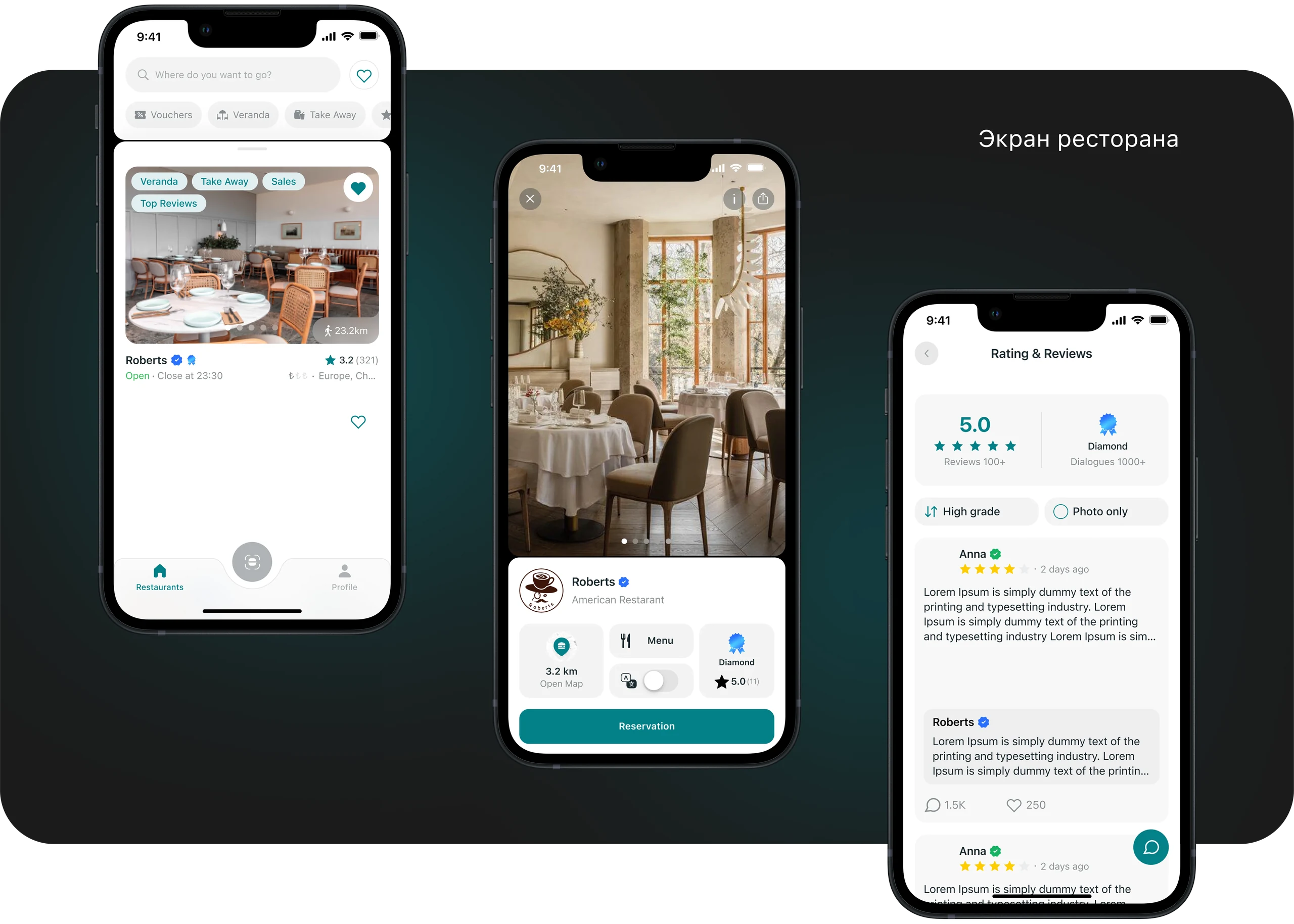
Nosh brings guests and restaurants together in one service. Guests can discover places, browse menus, order quickly, leave reviews, and tip. Restaurants can manage preorders and reservations, access analytics and notifications, and promote their location on the map.
My role
- Designed the app from scratch to make it intuitive to use;
- Ran research to understand user needs and improve the product design;
- Conducted usability tests to check whether the interface was clear and easy to use;
- Developed a design system to keep the interfaces consistent;
- Designed a landing page to promote the product.
S (Situation)
My brief was to design the Nosh mobile app and then a landing page to promote it. The product aimed to give guests a quick way to choose a restaurant, browse the menu, order, and leave a review without a waiter's help.
T (Task)
My goals were to:
- Research the market and identify useful practices.
- Create one service for guests and restaurants where people can find places, book tables, and leave reviews without waiting for a waiter;
- Make interactions faster and easier through clear navigation, a simple ordering flow, and instant payment;
- Create a promotional landing page to introduce the app and attract both guests and restaurant teams.
A (Action)
1. Research and analysis
- I explored the restaurant industry and how similar services work. Competitor analysis and benchmarking helped me identify useful practices and the main difficulties users face.
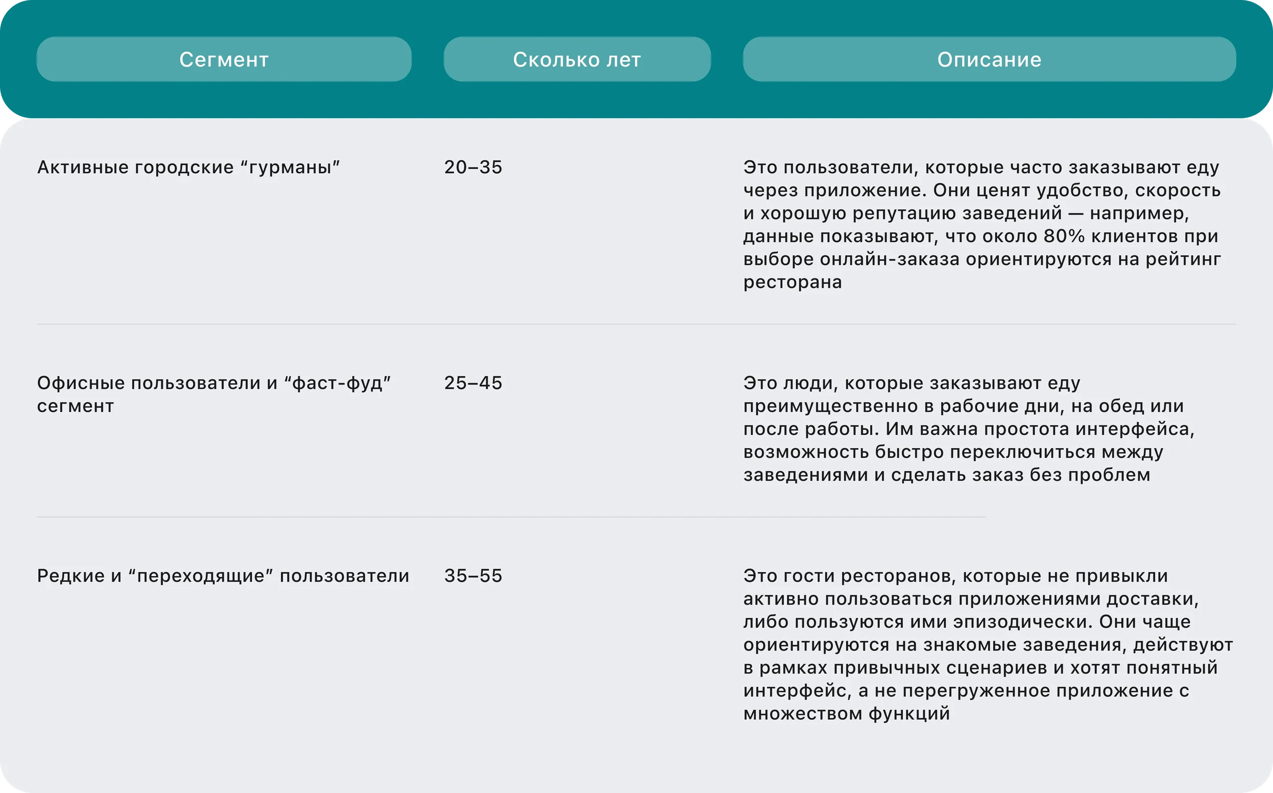
- I interviewed users to understand which tasks mattered to them and where they struggled. Based on these interviews, I developed hypotheses and defined user segments.
- I ran quantitative research in Pathway to test the hypotheses, identify the most important tasks, and set priorities.
Audience segments
Final hypotheses:
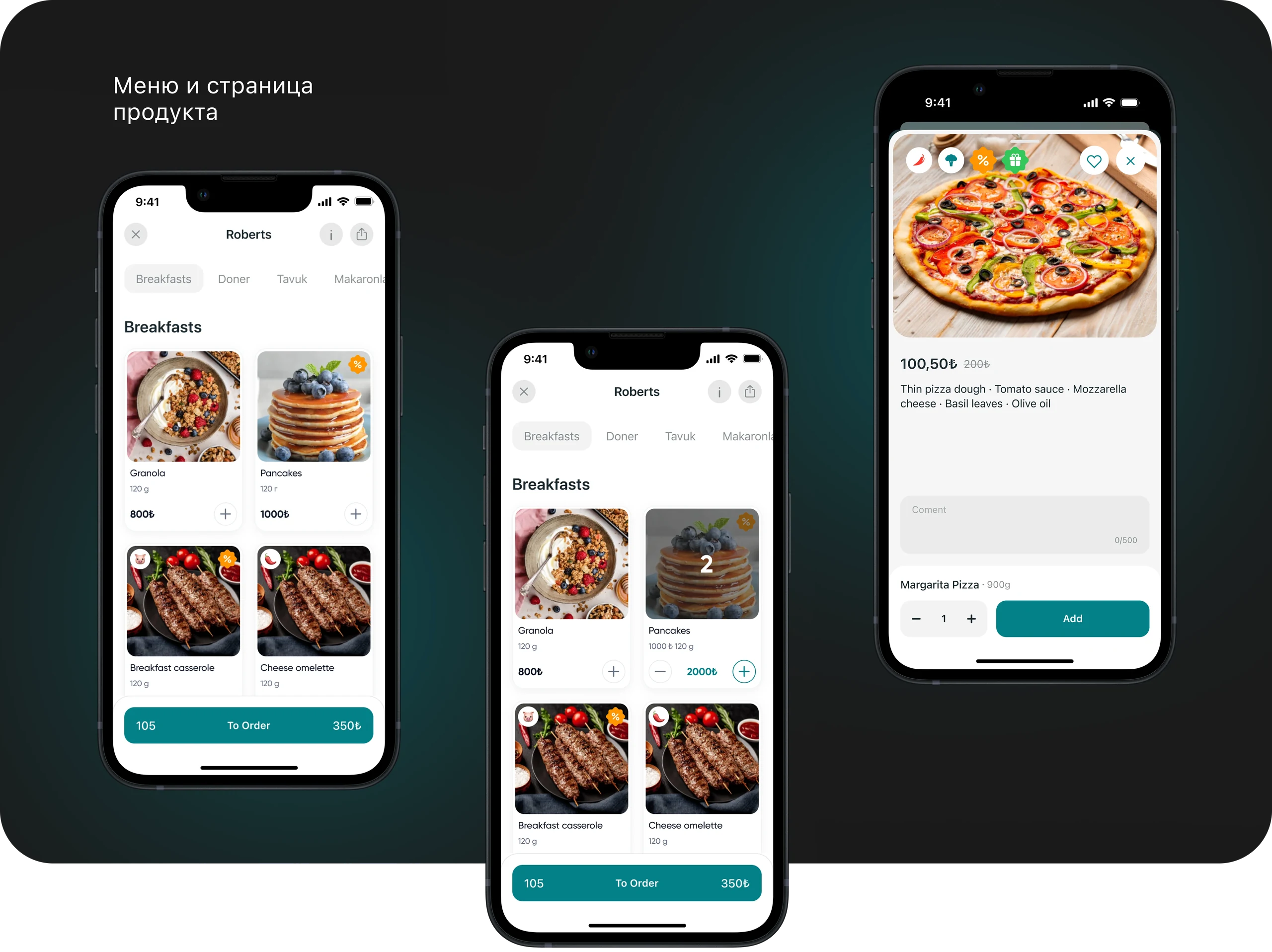
1. Preorders and reservations
Long waits at peak times often put guests off ordering. Letting them preorder food and book a table for a specific date and time should reduce waiting, increase the likelihood of an order, and raise average order value.
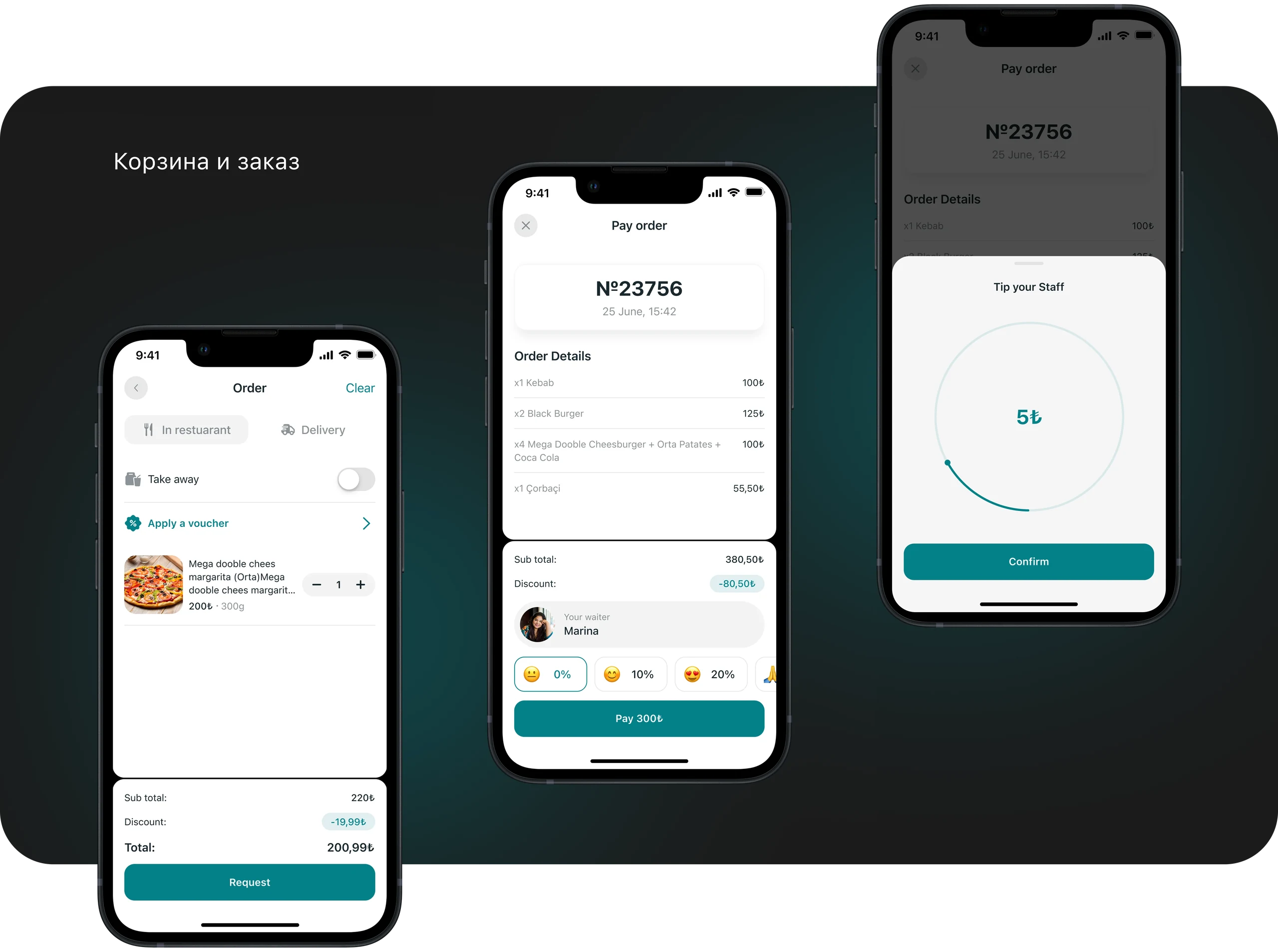
2. SELL500 voucher for the first order
New users hesitate to place their first order. Offering the SELL500 promo code should encourage that first purchase and increase user activation.
3. Restaurant ratings and reviews
Guests worry about choosing the wrong place. Ratings and reviews should build trust, reduce abandoned orders and refunds, and help people choose a restaurant faster.
4. Tips, staff motivation, and service
Tipping in person can be inconvenient. Quick tip presets after payment should encourage more guests to tip, support staff motivation, and make service quality more consistent, indirectly helping guest retention.
2. Prototyping
- Designed the information architecture and user flows;
- Created initial prototypes based on the research, with a focus on usability and fewer steps for common tasks.
3. Testing and refinement
We tested the prototypes with people who use food delivery apps. Based on their feedback, we adjusted the interfaces to make navigation more logical and easier to understand.
4. Final design
After testing and refinement, I designed the app and website and prepared a presentation to explain the work to stakeholders.
R (Result)
Expected outcome
The design aimed to shorten the journey from choosing a restaurant to placing an order, make preorders and reservations faster and clearer, and help guests choose with more confidence through ratings and reviews.
What I would track after launch
After launch, I would track first-order conversion, completed preorders and reservations, checkout drop-off, task completion time, and how often guests leave reviews and tips.