Earlybird
Earlybird is a marketplace for Japanese goods with worldwide delivery, including Russia, the US, the UAE, China, and England. The company has operated for more than 15 years and is a member of the Tokyo Chamber of Commerce. It describes its approach to service as Japanese: reliable, affordable, and attentive to quality.
On the home screen, people choose where to shop: Yahoo Auctions, Rakuten, or Yahoo Shopping. Rakuten and Yahoo Shopping work like a regular marketplace, with a cart, checkout, and fixed-price payment.
The brief
Design one marketplace for buying Japanese goods and taking part in auctions.
My role
- Designed the marketplace website from scratch for desktop and responsive layouts;
- Ran research to understand user needs and improve the product design;
- Tested the design through usability sessions to make sure the interface was clear and easy to use;
- Created a scalable UI kit for a consistent interface.
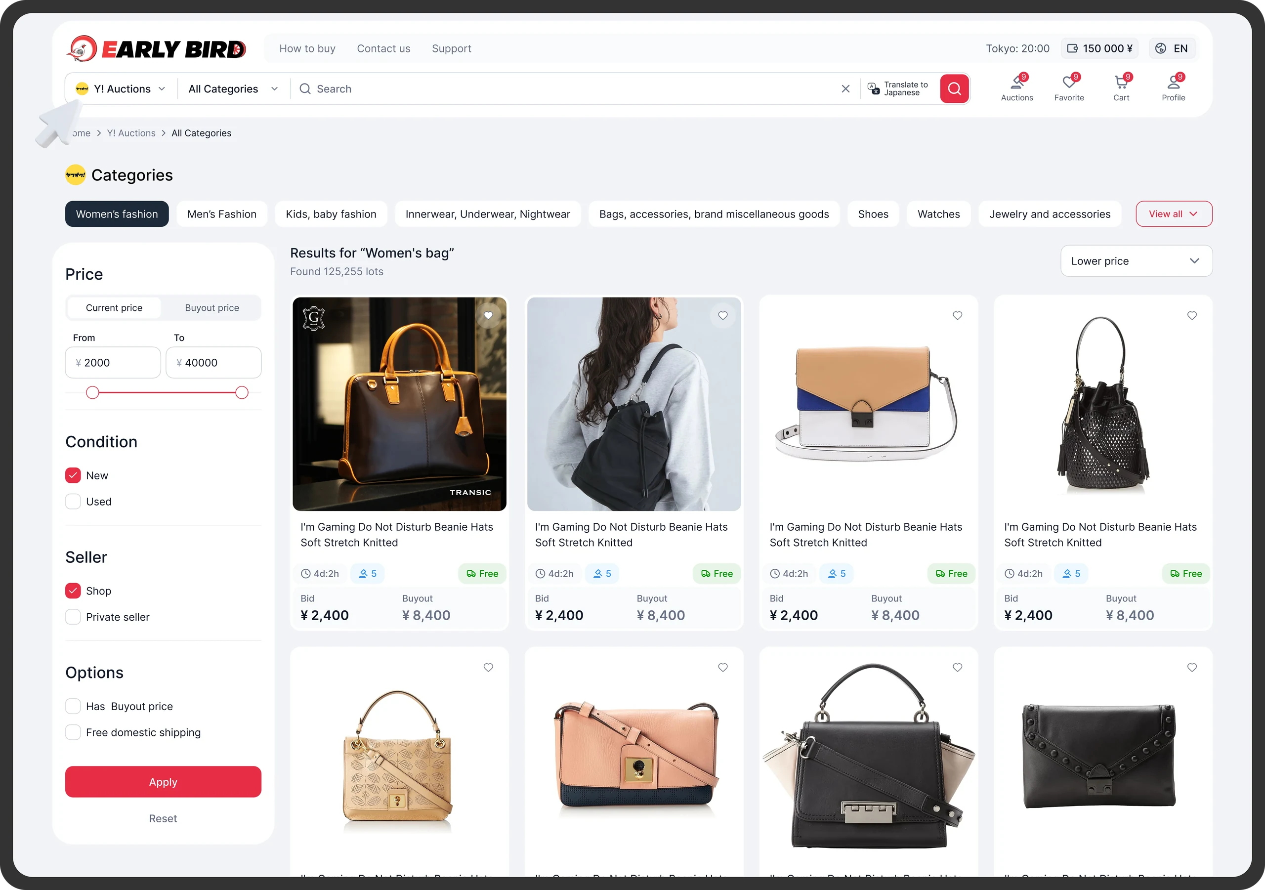
Auction catalogue
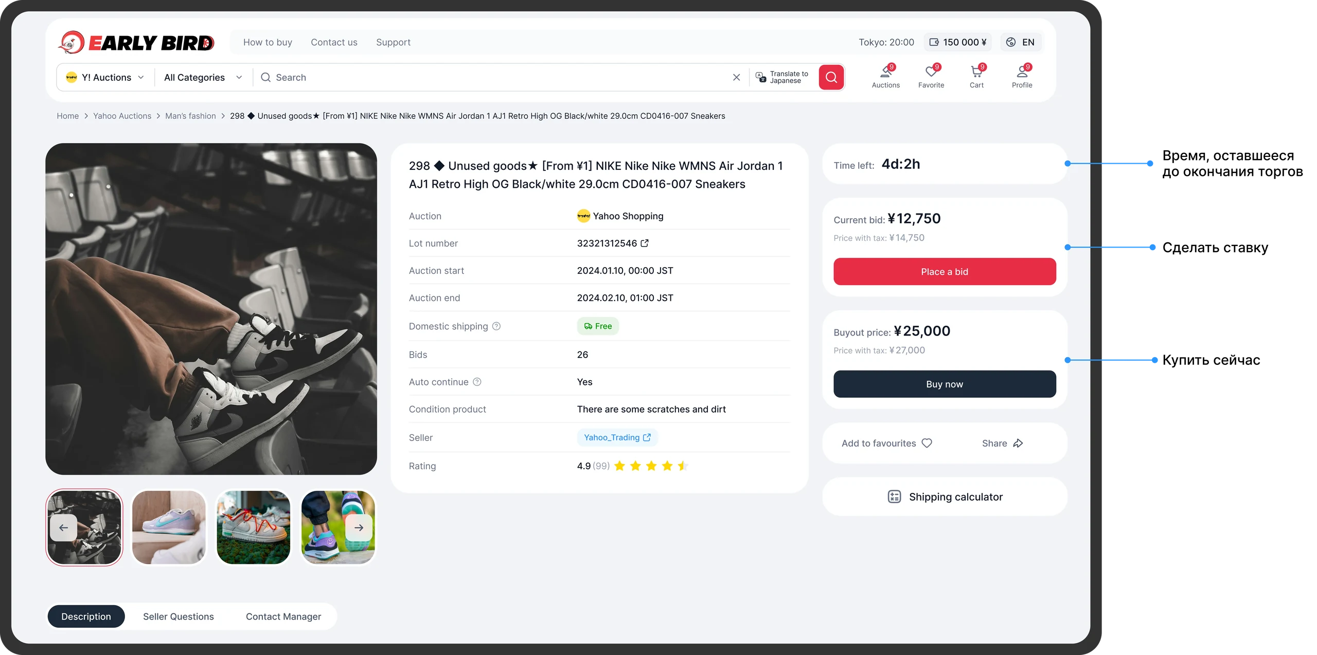
On Yahoo Auctions, users can bid on items, follow the auction, or buy an item immediately at a fixed price.
S (Situation)
Earlybird customers used to find items on Yahoo! Auctions or Rakuten and send them to managers, who placed orders on their behalf. The process was slow and inconvenient: customers had to wait, clarify details, and often could not see the final price or delivery date.
My brief was to design the Earlybird marketplace, bringing shopping and auctions together to make both easier to use. I handled the project independently, from research to testing and developer handoff.

T (Task)
My goals were to:
- Design a clear, easy-to-use interface to help attract new customers and increase sales;
- Build trust in the brand through transparent order tracking and delivery;
- Make purchasing easier for existing customers.
Target metrics:
- Positive feedback in testing and a 30% increase in satisfaction with the interface;
- A 10% increase in revenue.
A (Action)
1. Research and analysis
- I studied Japanese auctions and logistics, explored how similar services work, and compared competing marketplaces. This helped me identify useful practices and the main difficulties users faced.
- I identified the main user segments using the client's analytics.
User segments

- I interviewed people from the target audience to develop research hypotheses.
- I ran quantitative research in Pathway to test what builds trust in the service, whether checkout and delivery are clear, and which interface elements help users feel in control of their orders.
Quantitative research findings:
- Users need to understand the buying process. Most participants said they often could not work out the total price, including fees and delivery. This supported the need for a cost calculator and a visual breakdown of the checkout steps.
- Company information and reviews help build trust. Almost all participants wanted to know who runs the service and see real reviews and examples of past orders. This supported adding About us and Reviews sections.
- A step-by-step explanation makes the service more predictable and reduces anxiety. New users in particular found it hard to understand how it works. This supported adding a How it works section covering each stage, from purchase to delivery.
- The interface needs to be simple and intuitive. Experienced shoppers found Japanese sites cluttered, while newcomers said they were afraid of making a mistake. This supported a pared-back design with a consistent visual style.
The interviews and quantitative research led to the product hypotheses below.
Final hypotheses
1. A transparent buying process
Users do not understand the stages of an order or where they are in the process. A How it works section explaining each step, from choosing an item to delivery, should reduce anxiety and make the process easier to follow.
2. Clear pricing
Users cannot see how the total price is calculated and worry about hidden fees. We proposed a cost calculator, including service fees and domestic and international shipping, to build trust and reduce checkout abandonment.
3. Trust in the brand
New users struggle to trust a shopping intermediary without company information. An About us section describing the service and its partners, alongside customer reviews, should make the business feel more open and reliable.
4. A simple, familiar interface
Users find Japanese sites cluttered and ordering confusing. A light, simple interface that follows familiar marketplace patterns should help them find their way faster and make fewer mistakes.
My auctions
I designed a page where users can follow their bids and see all their auction details.

2. Design
I used the research findings to design the marketplace around straightforward navigation and fewer steps for common tasks. The aim was to make browsing platforms and taking part in auctions simple and accessible.
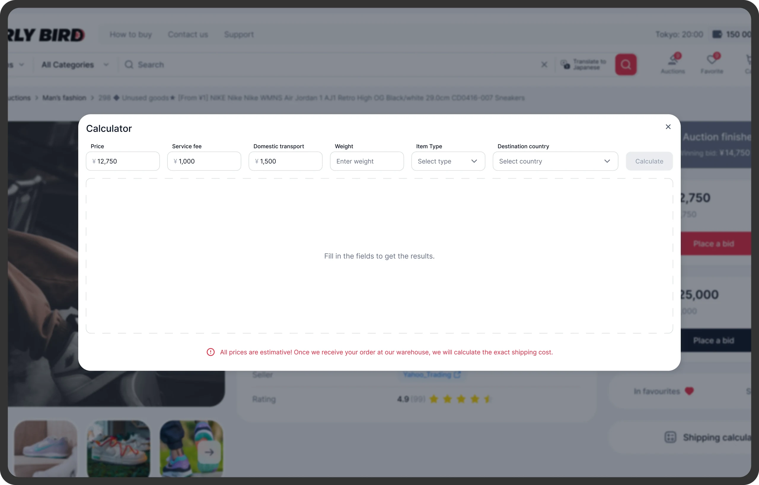
Cost calculator
I added a calculator so users can estimate the total cost, including service fees and delivery.
3. Testing and refinement
I tested the prototypes with:
- People in the target audience who had already ordered Japanese goods through intermediaries;
- Newcomers who had never used a service like this.
In the final round of testing, users completed the proposed tasks without difficulty.
4. Final design
After testing and refinement, I created a simple, visually light design with navigation that also made sense to people new to Japanese marketplaces. I prepared a presentation to explain the design to stakeholders.
Payments and balance
Users can view their payments and purchase history and top up their balance.

R (Result)
Expected outcome
The design aimed to make shopping and bidding more understandable and predictable, build trust through transparent pricing, and let users place orders without a manager's help.
34% CSAT
Users gave positive feedback during testing, and satisfaction improved compared with the first iteration.
Revenue increased by 14%
The client tracked this result, but without product analytics it cannot be attributed to design alone. I would also track purchase conversion, calculator usage, and where users abandon checkout.