Shokoladnitsa
Shokoladnitsa is a major Russian coffee shop chain. It began as a café near Oktyabrskaya metro station in 1964, serving its signature hot chocolate and crêpes. The brand was refreshed in the 2000s with a new menu and interiors focused on guest comfort.
S (Situation)
When I came across the Shokoladnitsa app, I was surprised by how dated and cluttered it looked. It fell short of what users expect from a modern app and did little to make ordering easier for regular guests. I wanted to rethink its structure and visual language to make it more useful and up to date.
The problem
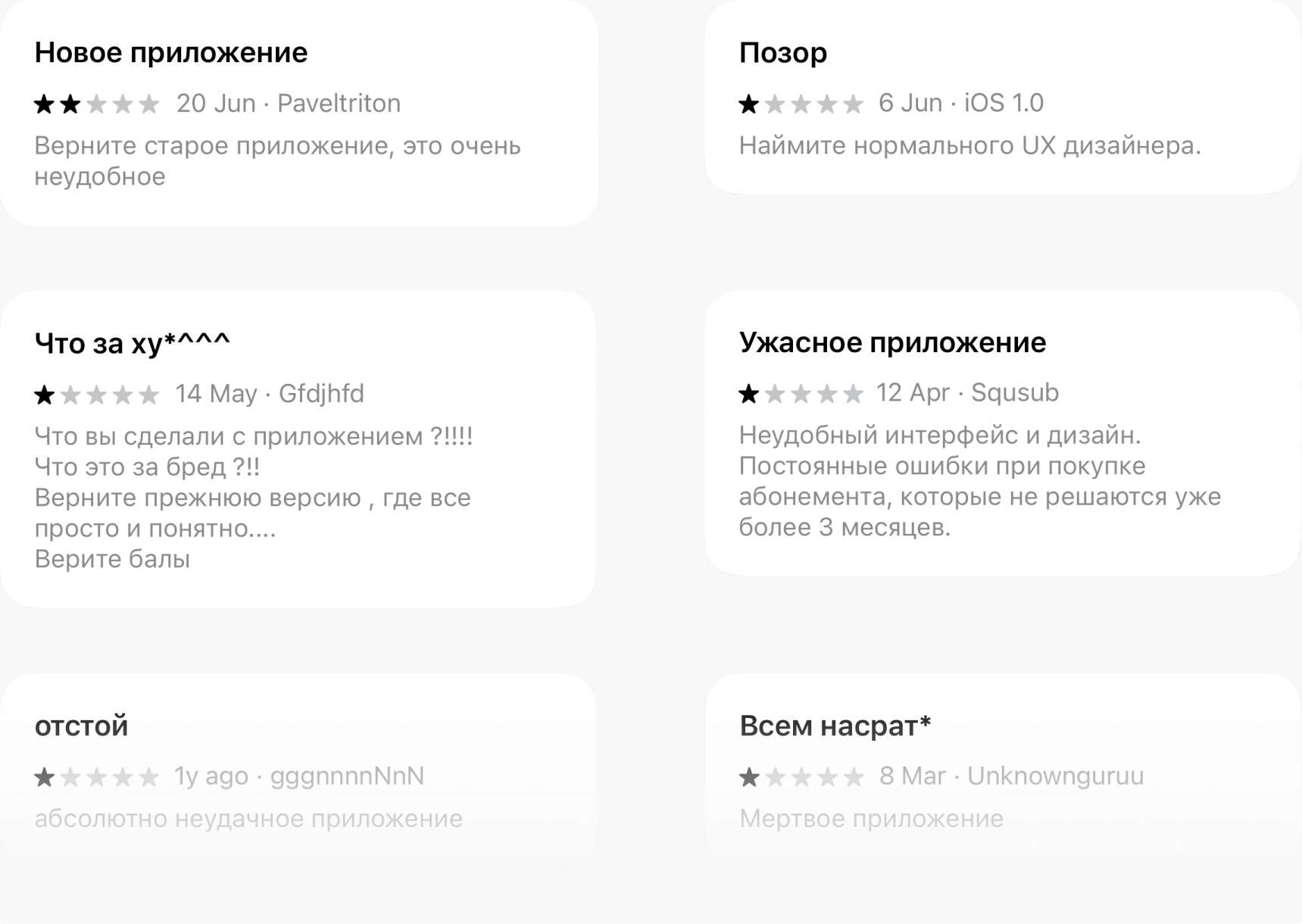
App Store reviews pointed to high user churn: many people who installed the app did not become regular users. This affects revenue and the service's long-term growth.
Reviews
T (Task)
My goals were to:
- Research the foodtech market and identify useful practices;
- Explore gamification to improve engagement and retention;
- Design an interface that is clear, easy to use, and visually appealing;
- Test prototypes with users and refine them based on the findings;
- Create a final design concept based on research and testing.
Home screen
I moved the loyalty programme onto the home screen, with quick actions and game features at the top. I brought offers and the menu into one section, with filters to switch between them.

A (Action)
1. Research and analysis
I researched the foodtech market, compared competitors, and identified useful practices and common user frustrations. This helped me form hypotheses about improving retention and engagement.
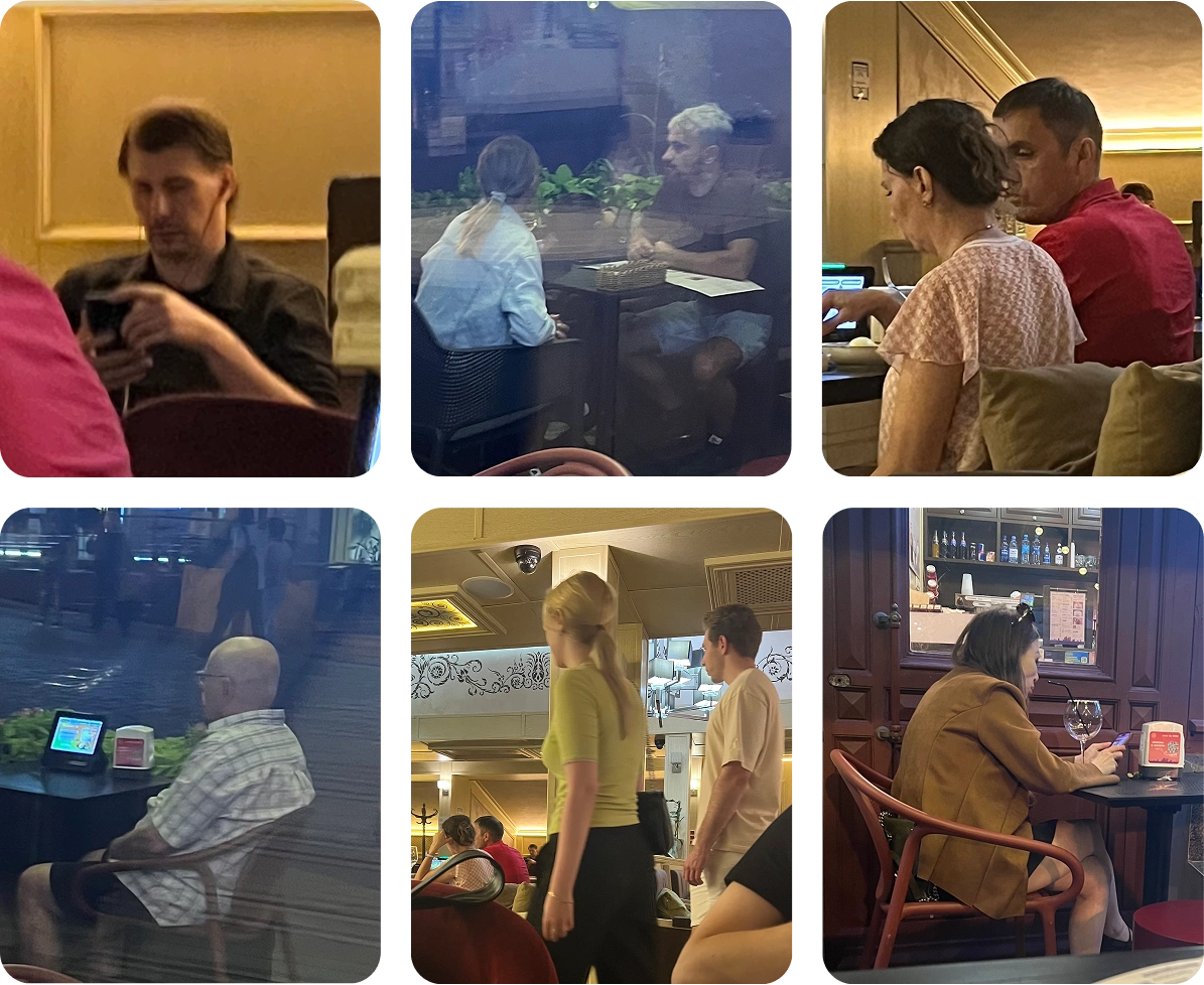
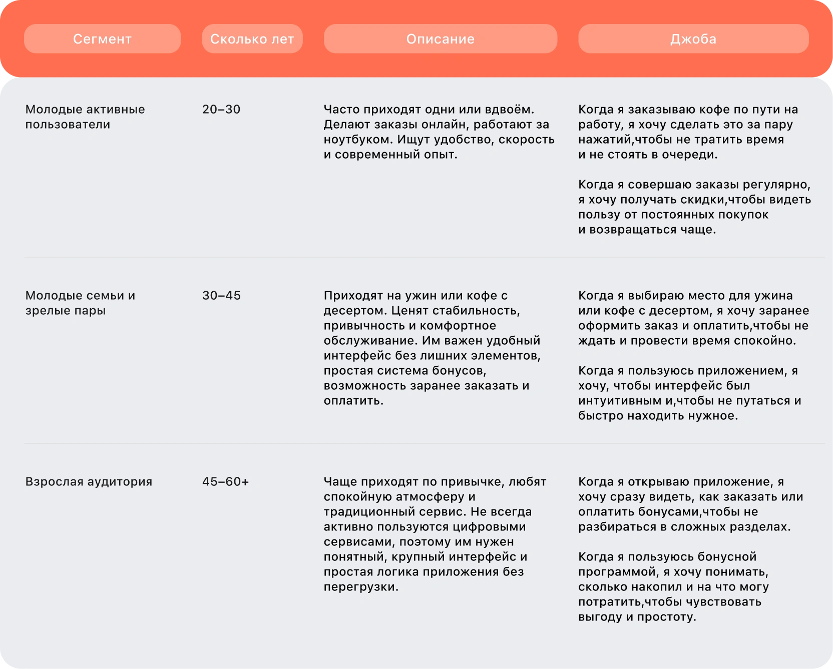
I observed guests in coffee shops to understand the audience, noting different types of visitors and how they behaved. These observations helped me define the main user segments.
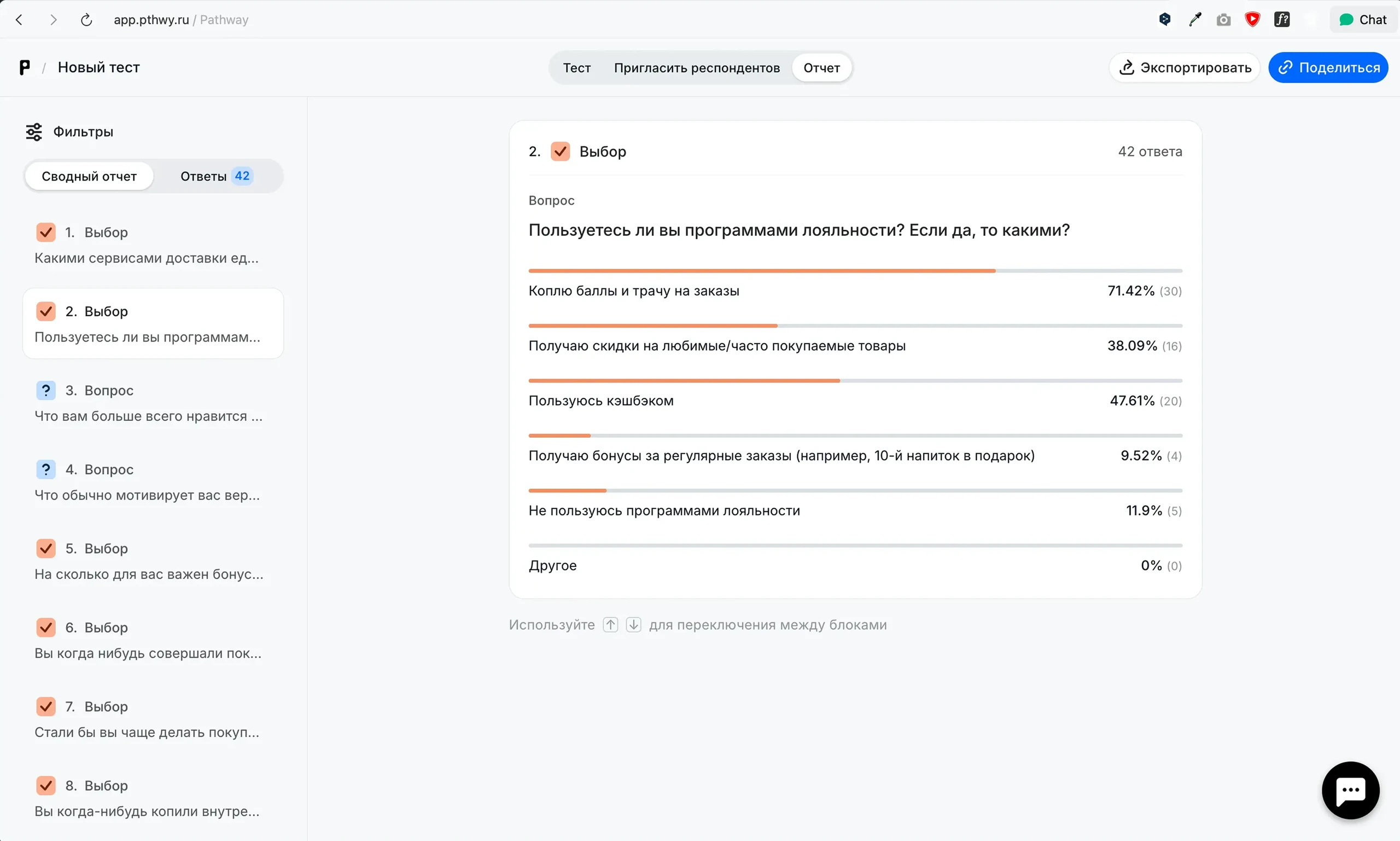
I ran quantitative research to find out which features encourage engagement and retention, and which go unnoticed or put people off.
Shoksy
Shoksy are the app's currency. Users earn them as a percentage of each order or by logging in daily, then spend them on selected products in the app.

Quantitative research findings:
- Points and discounts on favourite products were the most-used loyalty benefits. Along with favourite dishes and fast delivery, these rewards gave users a reason to return to the app.
- Around 30% of the audience made purchases for cashback or a discount.
- Most participants were interested in in-app currency and had generally positive experiences with it.
- The research supported game features: many users opened apps for a daily bonus. The reward mattered, with a free drink or dessert attracting the most interest.
- The research did not support the hypotheses about a free tenth drink, the importance of a first-order discount, or well-crafted push notifications.
Final hypotheses
1. Shoksy
Users see little long-term benefit in ordering and have few reasons to return. Awarding coins for orders and letting people exchange them for rewards should encourage repeat orders, retention, and engagement.
2. Favourite products
Finding and reordering favourite items is difficult, which makes ordering less convenient and less frequent. A favourites feature with discounts on saved items should make repeat orders faster and encourage people to come back, increasing repeat purchases and retention.
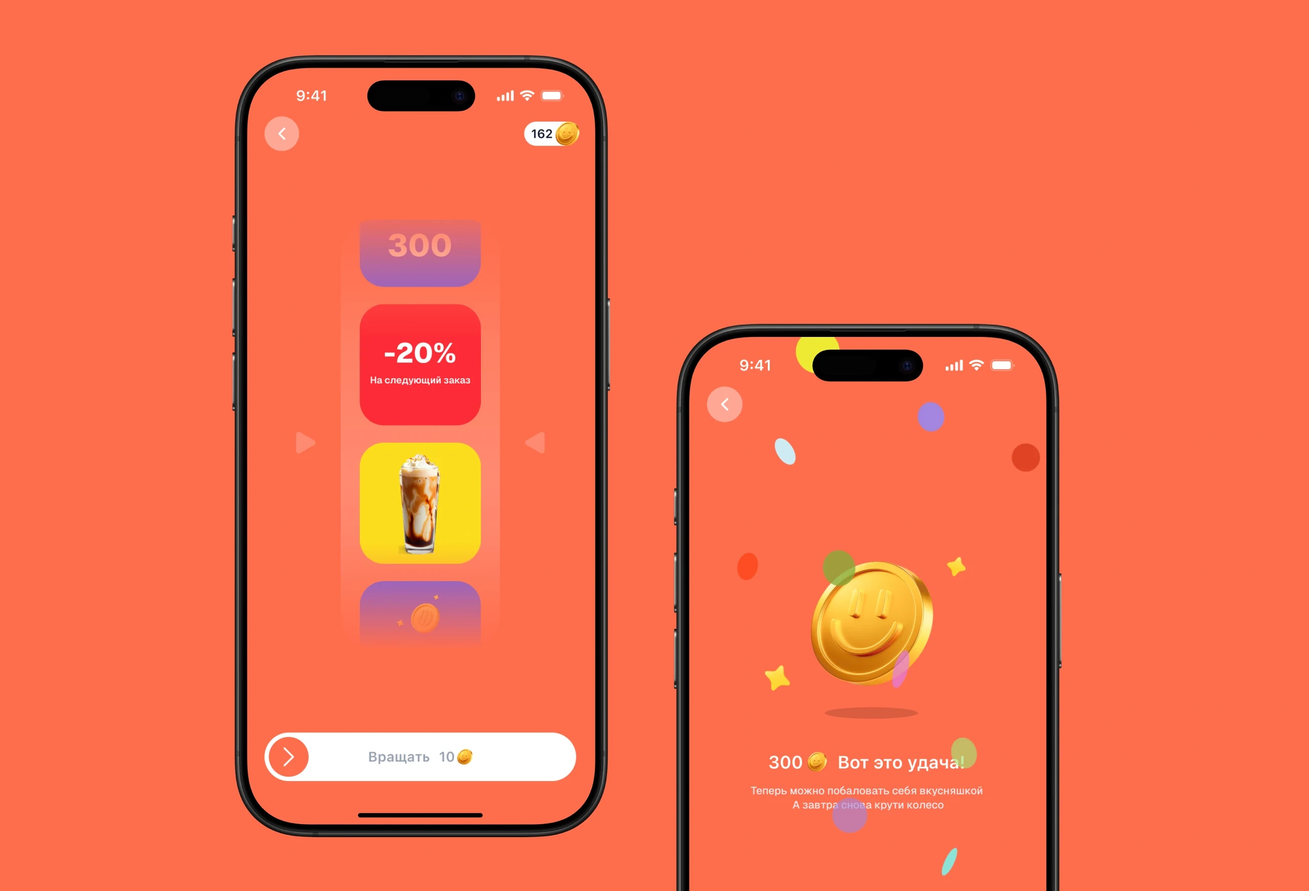
3. A prize wheel and daily login bonus
Users do not open the app every day, and engagement is low. A daily bonus and prize wheel should give them a reason to open and use the app more often, increasing daily active users and engagement.
4. A regular discount on a chosen favourite
Finding and reordering favourite items is difficult, which makes ordering less convenient and less frequent. A favourites feature with discounts on saved items should make repeat orders faster and encourage people to come back, increasing repeat purchases and retention.
Product
Users can choose a favourite product and get a discount on it throughout the week.
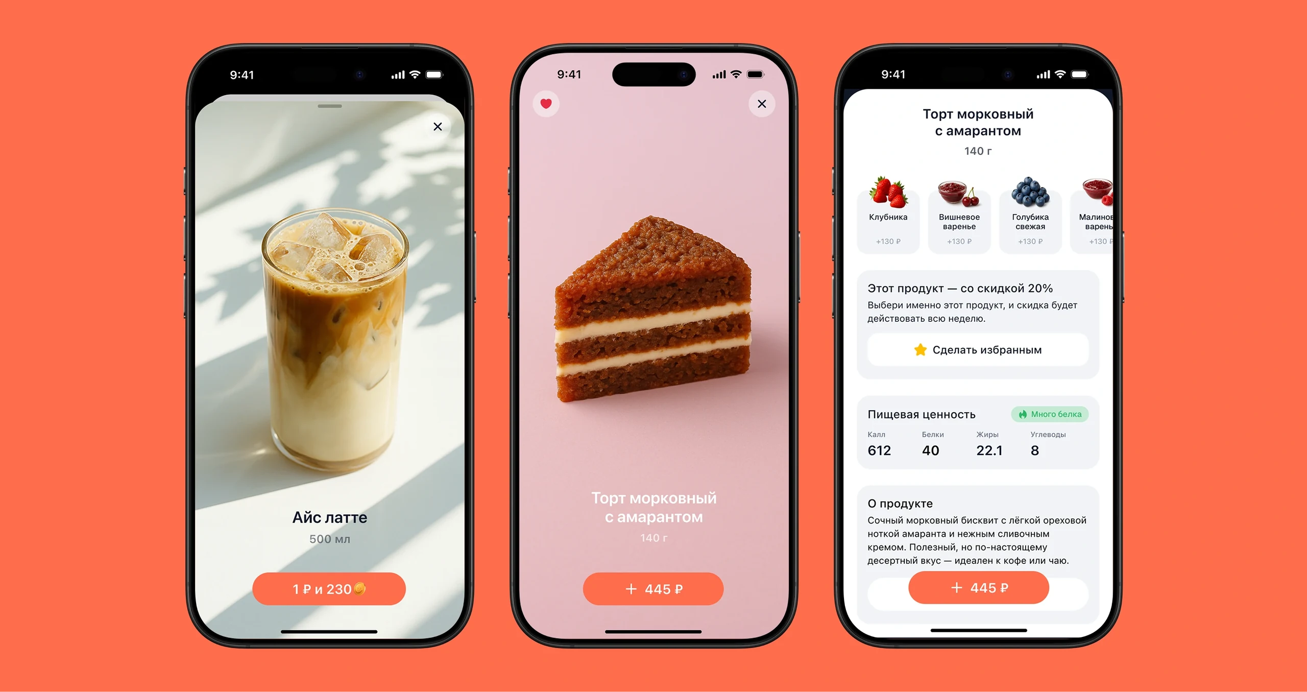
Product
Users can choose a favourite product and get a discount on it throughout the week.
2. Redesign
I used the research to redesign the app around easier navigation and fewer steps for common tasks. Simple interactions, accessibility, and a clean visual style were intended to make the app feel light and modern.
Prize wheel
Spin the wheel to win Shoksy, discounts, drinks or desserts!
3. Testing and refinement
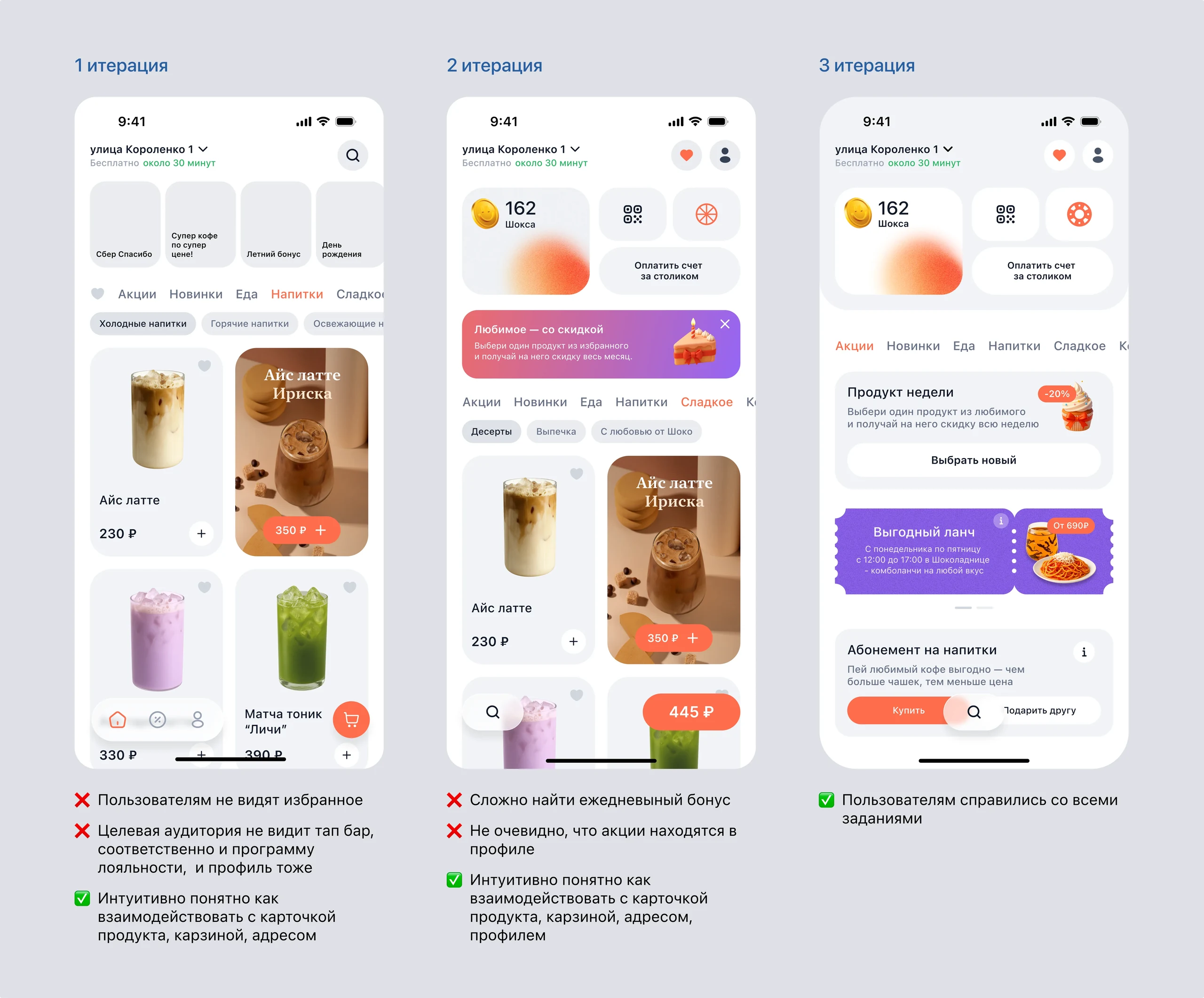
I tested the prototypes with users.
The first round revealed a major problem: the core audience, aged 30 to 50, missed the tab bar entirely. Its unusual shape and light, glass-like background made it hard to notice, so they could not reach their profile or loyalty programme. I removed the tab bar and moved the loyalty programme to the home screen.
- The second round revealed smaller navigation issues. I adjusted the screens to make the routes clearer.
In the final round, participants completed the task without difficulty.
Iterations

4. Final design concept
After testing and refining the layouts, I created a clean, modern visual design.
R (Result)
48% CSAT
Users gave positive feedback during testing, and satisfaction improved compared with the first iteration.
Halved the steps in the main user flow
Streamlining navigation reduced the number of steps in the main flows and helped users complete tasks faster.
What I would track after launch
After launch, I would track retention, loyalty programme usage, activation of game features, order conversion, and drop-off in the main flows.
